Package & label design

Packaging systems that get chosen on the shelf that get chosen on the shelf

Package design Visual system Retail products Brand consistency Compliance Shelf impact

Packaging design and label systems built to get products chosen on the shelf. A collection of strategic packaging systems and visual solutions — designed so products show well across retail environments and communicate their value to shoppers.

What this category covers

Packaging and label systems built to be used in real stores. The focus is how a product communicates value, function, and brand through structure, typography, color systems, and information hierarchy. Every piece is designed for the physical package and the digital screen — and for the product line’s future expansion.

CASE STUDY 01

Complete packaging for a new product line

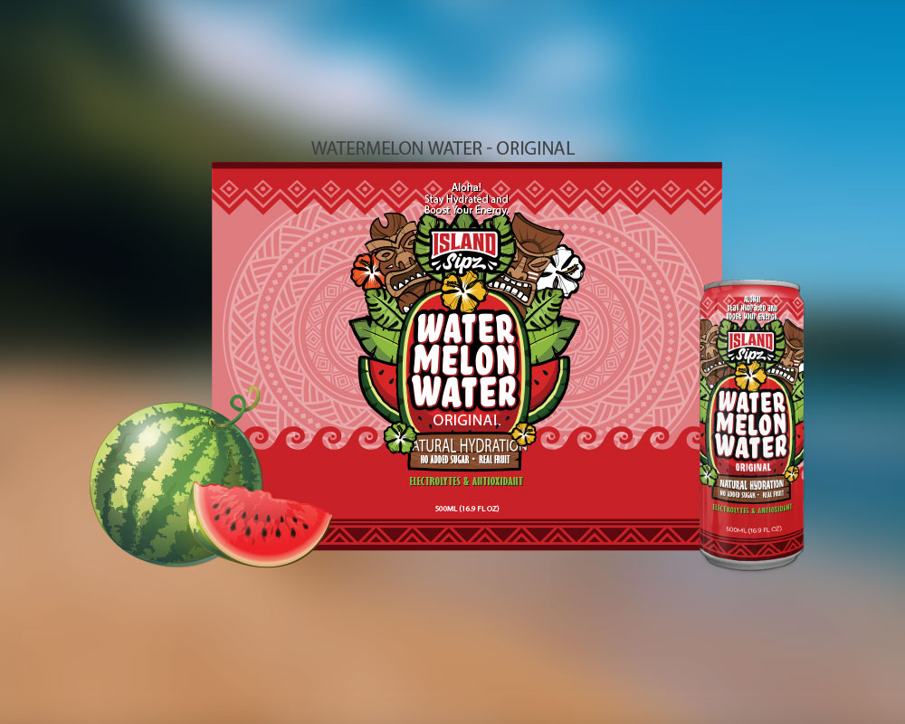
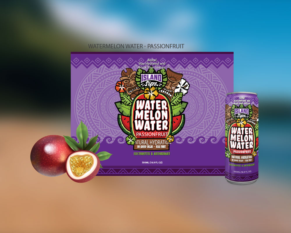
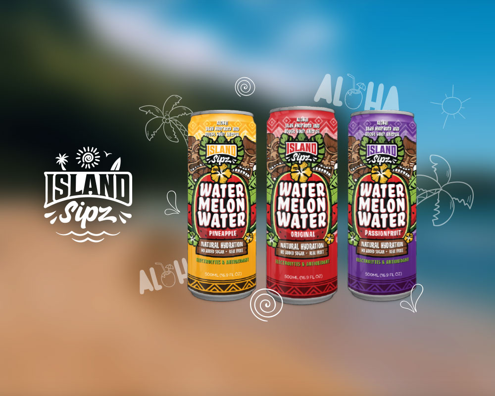
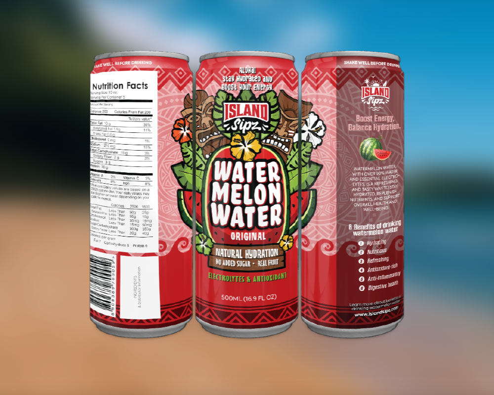
ISLAND SIPZ - Watermelon Water

Island Sipz is a Hawaii-based tropical beverage distribution brand.

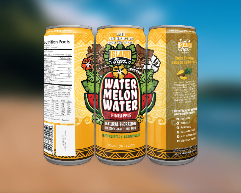
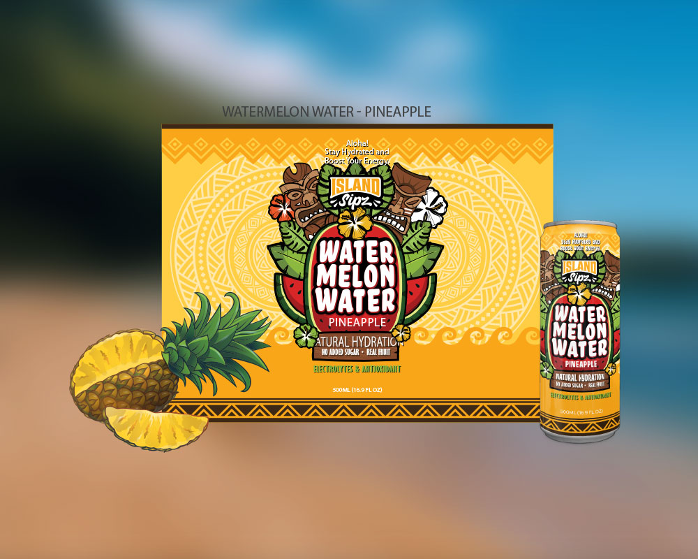
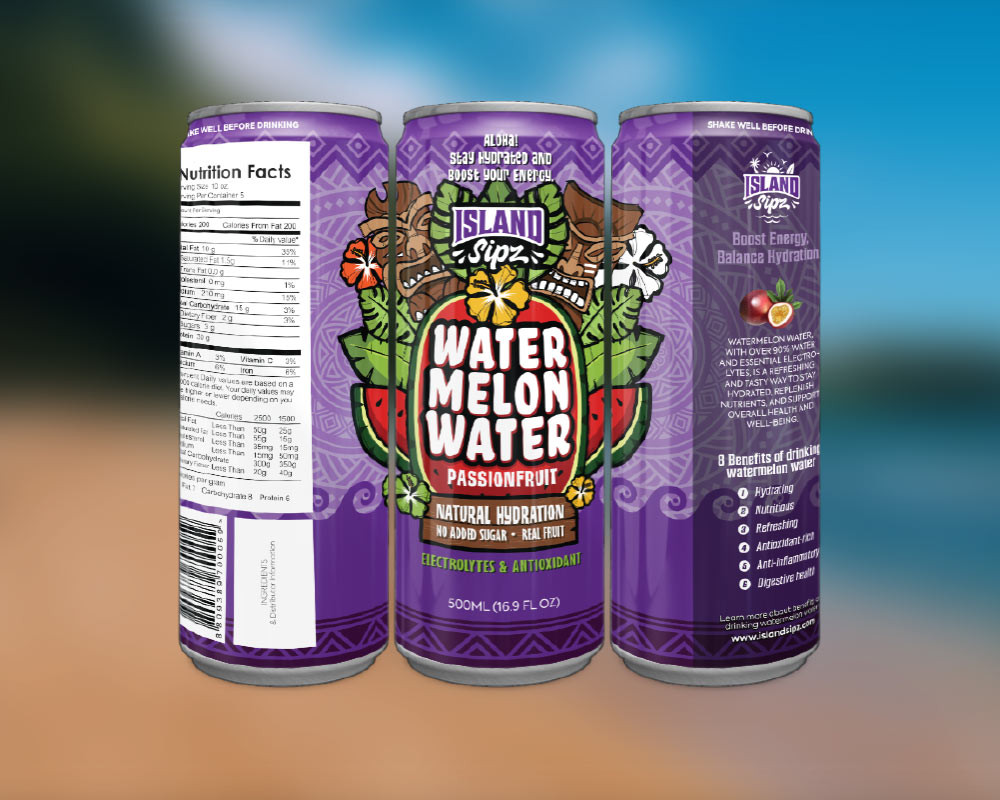
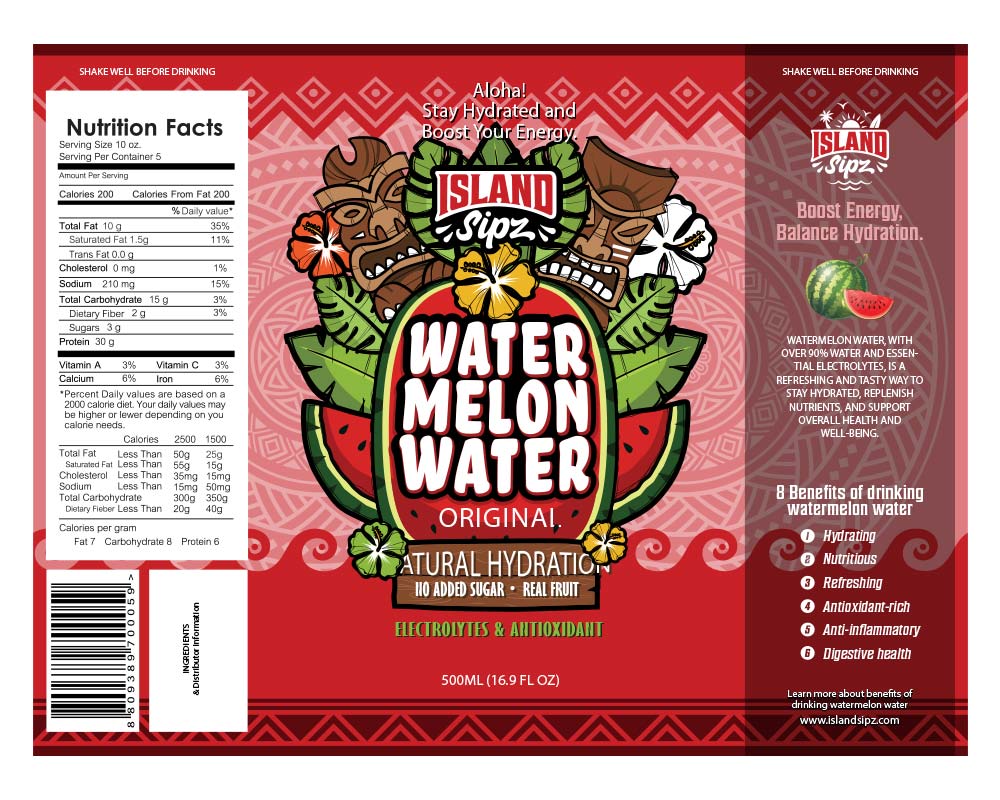
For their new Watermelon Water launch, we handled the full package and brand design — building a system that accounts for retail distribution and future product expansion.

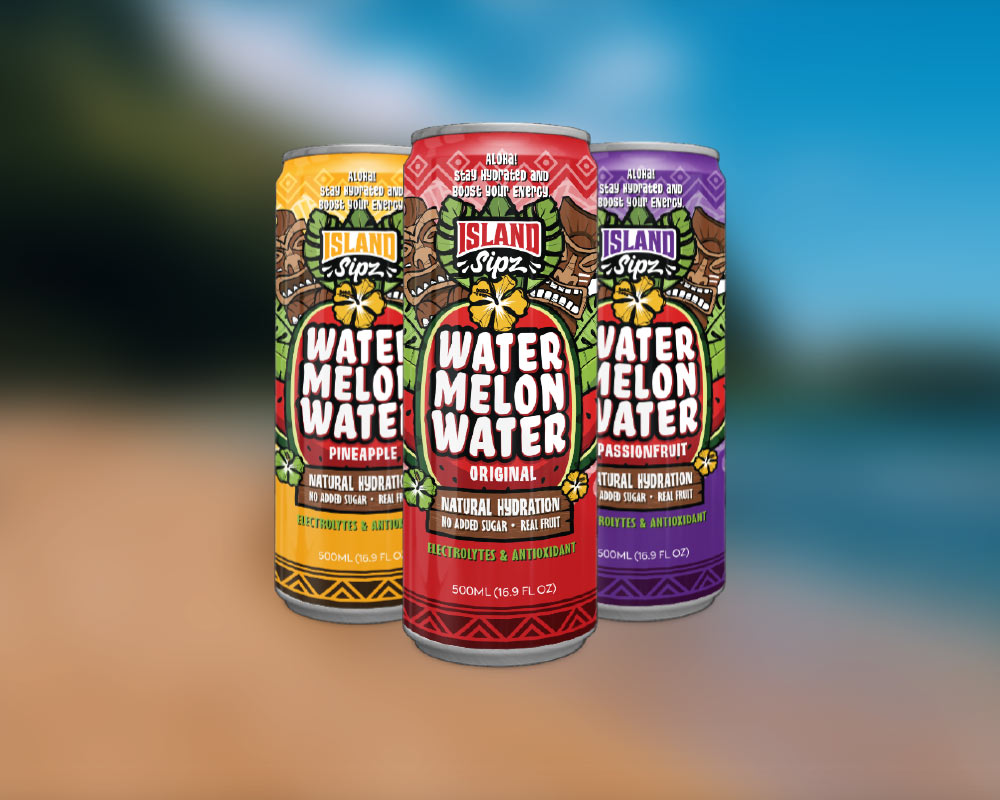
We didn’t design the Watermelon Water as a single label. We designed it as a complete packaging system — introducing the new line with strong shelf presence, while leaving room for flavors and formats to come.

From color hierarchy and typography to flavor differentiation and print-ready layouts — every element was built to stay consistent across the can, the marketing visuals, and the store.

A project that shows the balance between bold visuals and the real-world demands of packaging.

CASE STUDY 02

A field-ready label system for food made fresh daily

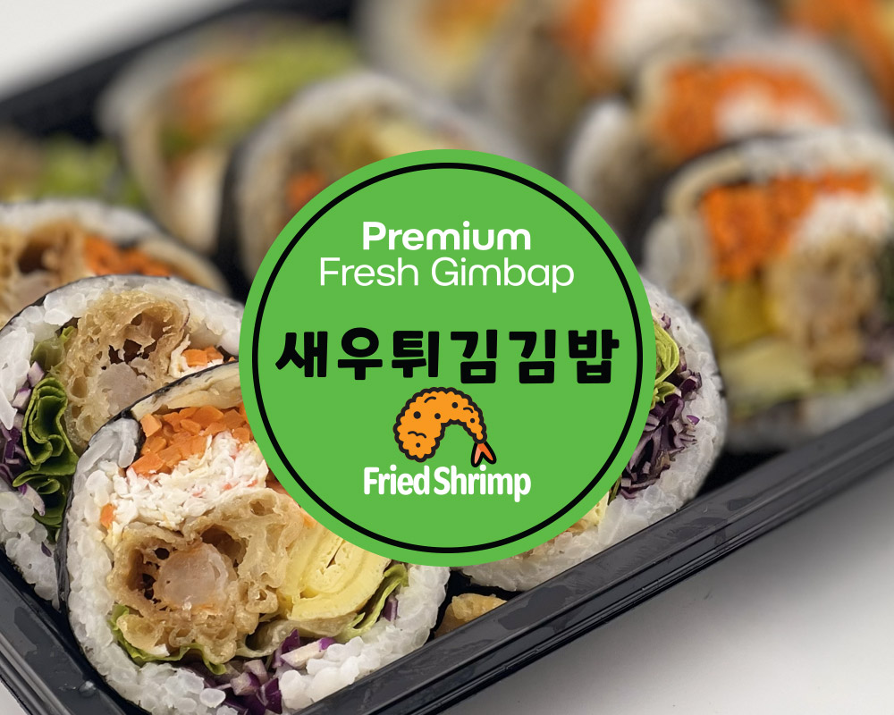
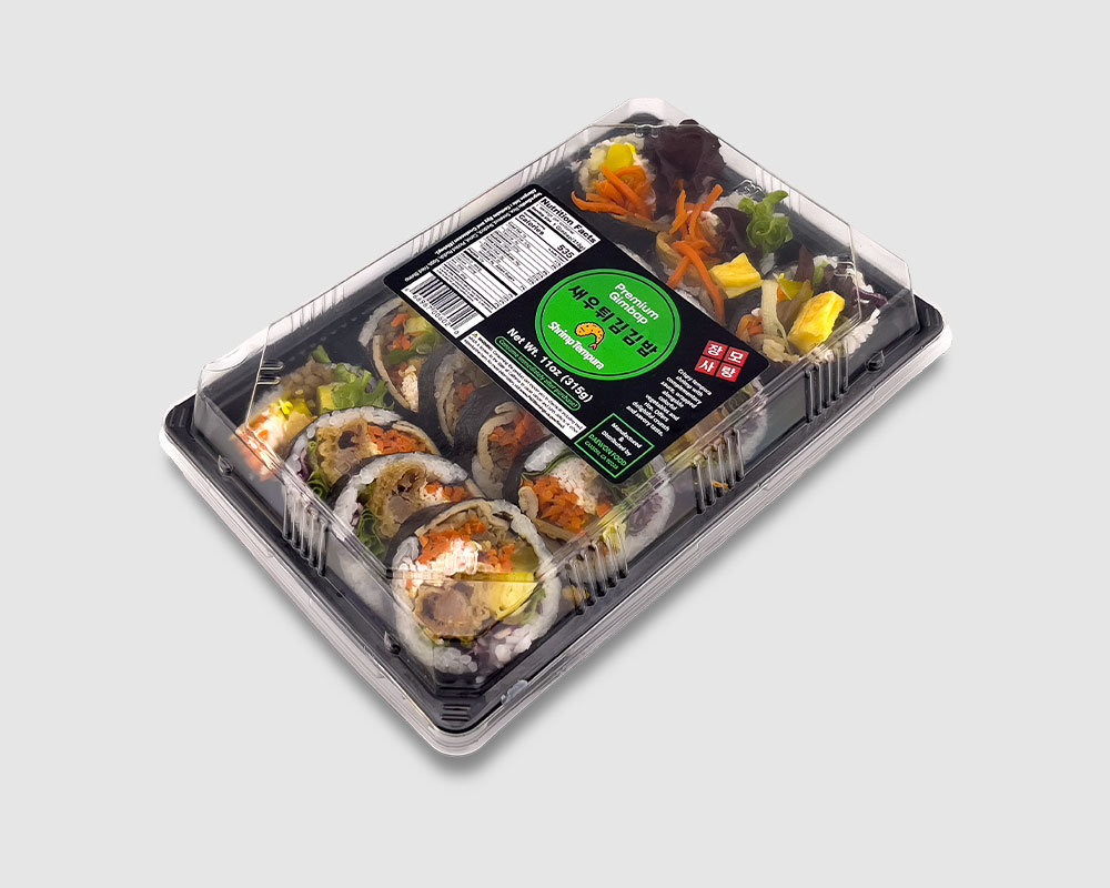
Premium Fresh Kimbap

Premium Fresh Kimbap is a Korean food brand made fresh every day and distributed through local retail partners.

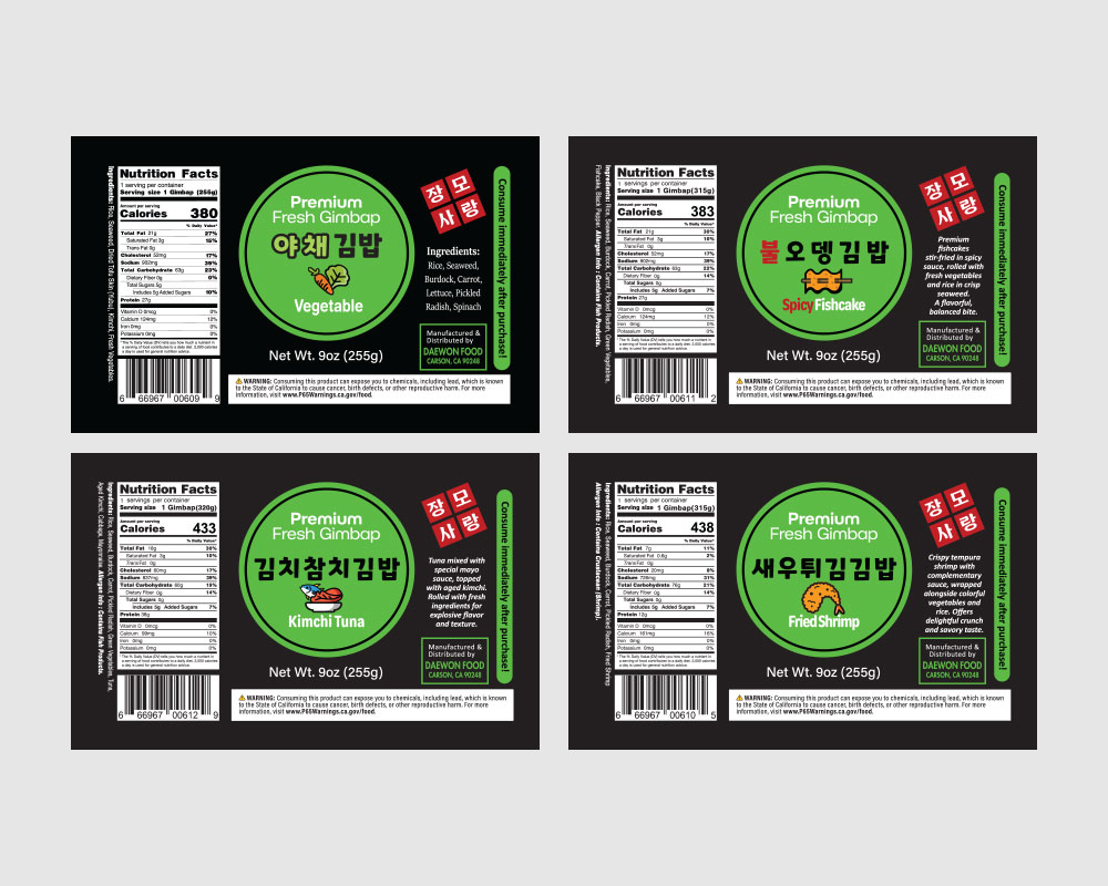
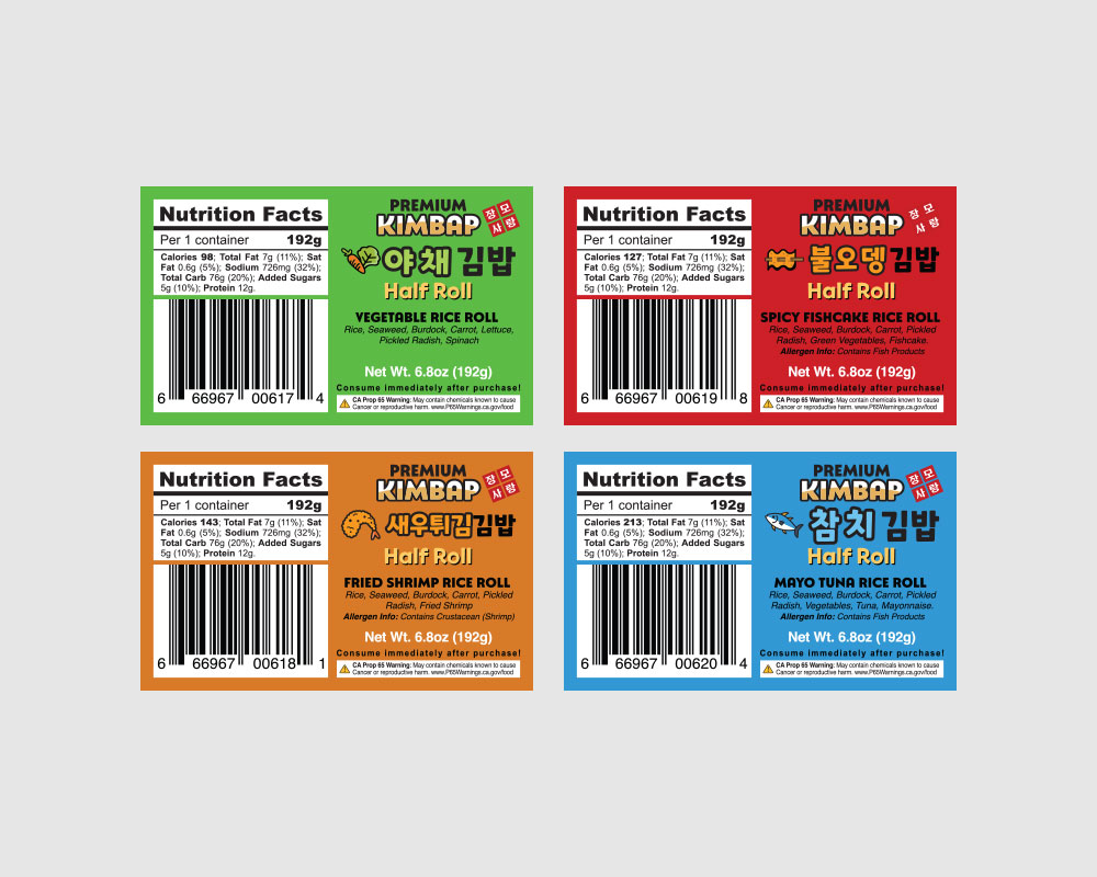
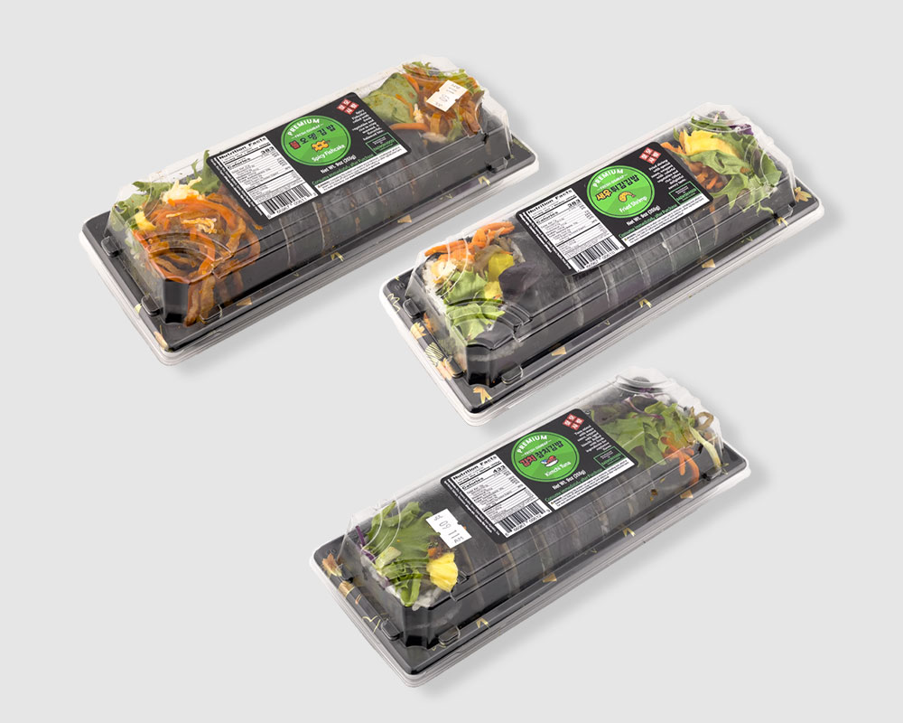
This project focused on a practical label system built for freshness, speed, and consistency. The goal: labels that keep up with frequent production cycles, distinguish products clearly, and apply reliably across many kimbap varieties.

Clear information hierarchy for fast recognition

A flexible layout that handles many SKUs changing daily

Print-ready files built for speed and accuracy

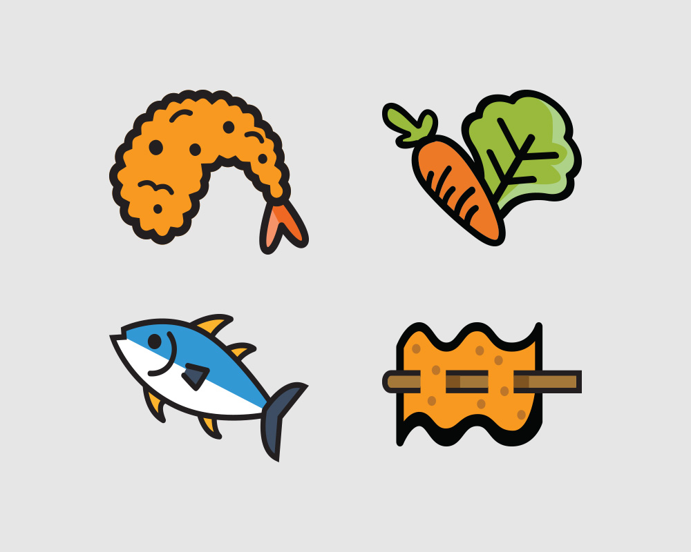
A consistent visual language across every variety

The result is a label system that holds up under real production conditions. Through high-volume runs, daily changes, and demanding requirements, the visuals never break down or cause confusion.

CASE STUDY 03

Structural packaging that translates function into retail language

VESI 9

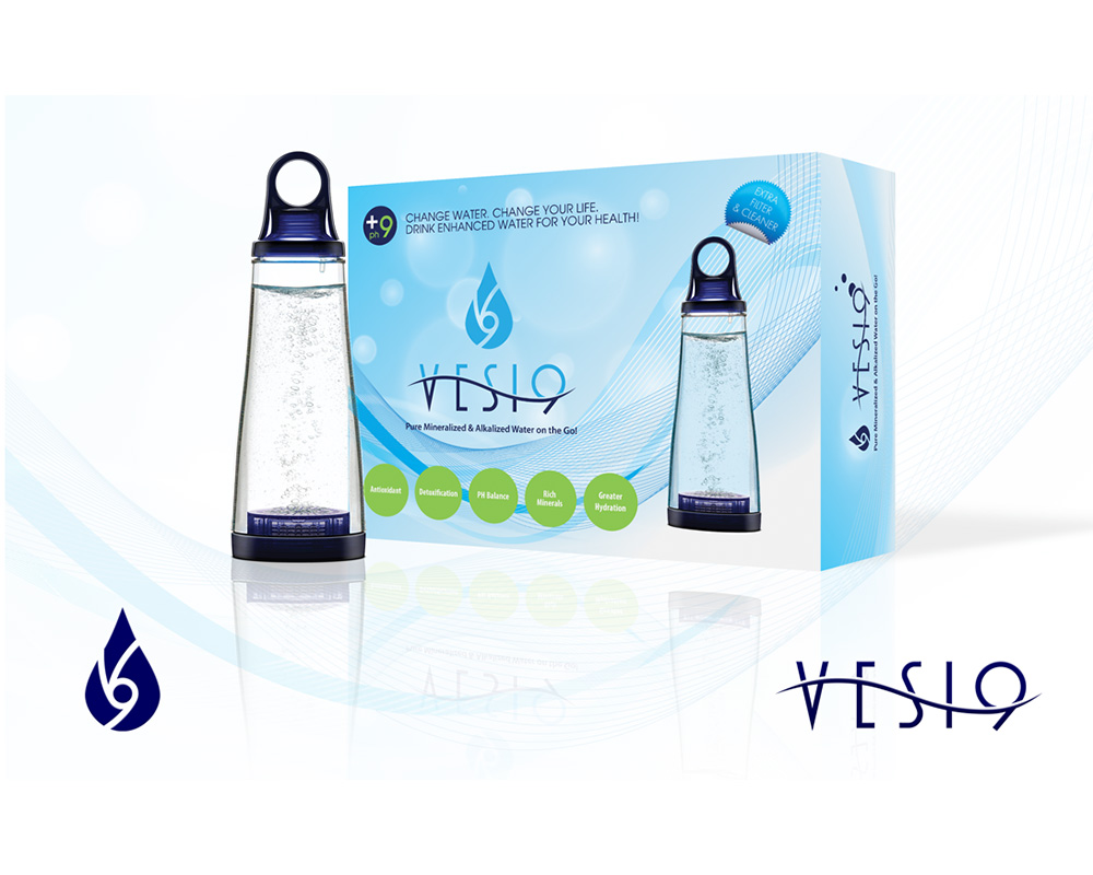
VESI means “water” in Finnish. VESI 9 is a portable alkaline water bottle that shifts your drinking water to a balanced pH 9 through a mineral filtration stone built into the base.

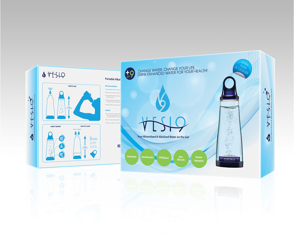
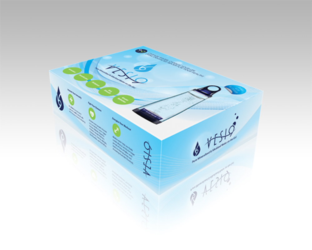
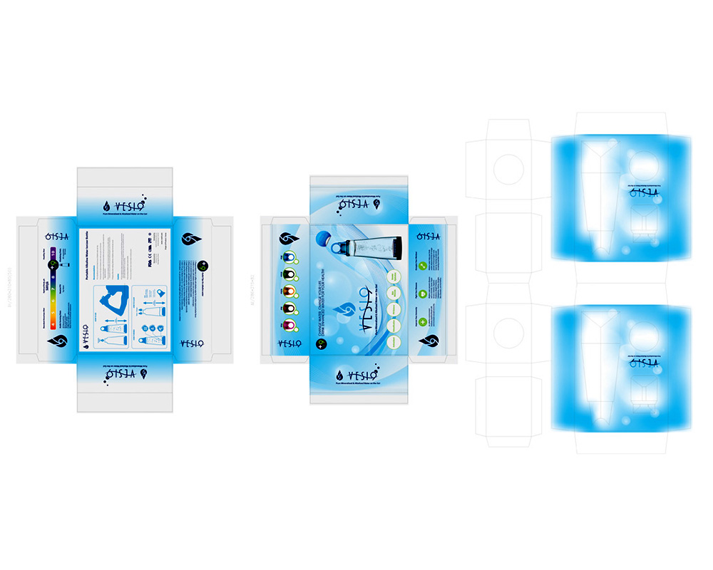
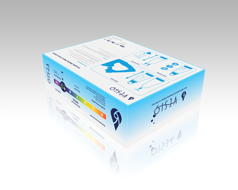
We developed the product’s full brand identity and a multi-configuration box system — translating functional innovation into a clear, retail-ready design language.

A modular paper package structure was designed to hold the bottle’s six color variants, pairing an outer box with a protective inner insert to secure stability in transit and visual consistency across the whole line.

From the outer graphics to the internal structural layout, this package holds health positioning, technical credibility, and shelf presence together — supporting both individual sales and scalable distribution. Clarity, compliance, ease of manufacturing, cost efficiency, sustainability, logistics, and brand consistency were all built to stay steady in a shifting market. It’s a project that shows how a functional product can move up a level through a consistent brand system and precise structural packaging.
Get your packaging right before launch

Launching a product or expanding a line, we’ll design a packaging system with you from the start — one that does its job on the shelf and on the production floor.

Reach out in Korean or English · Specialists for Korean-American businesses in the U.S.